优秀的字母与icon排版设计,让护肤品包装更显简洁、耐看、有购买欲望设计,设计欣赏
packaging creation: the greek studio
文字及编辑:www.hufu.club 护肤俱乐部
YOUTH LAB COSMETICS
A product that target women who are well informed and prefer not to spend on highly advertised products
针对那些女性购买产品本身而非为广告买单
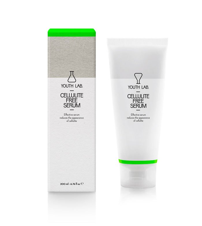
cellulite free serum 消脂精华
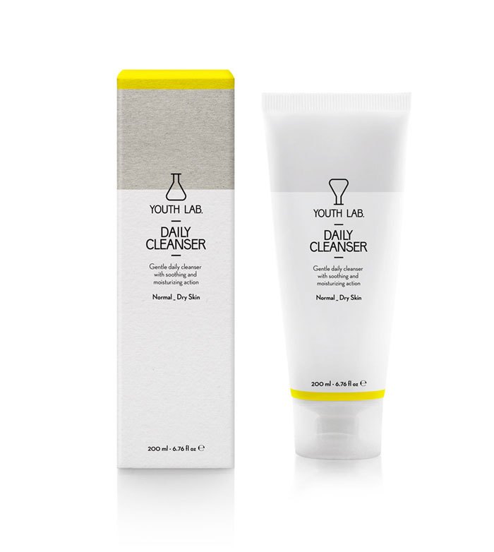
daily cleanser normal_dry skin 日用洁面乳(一般到干性肌肤)
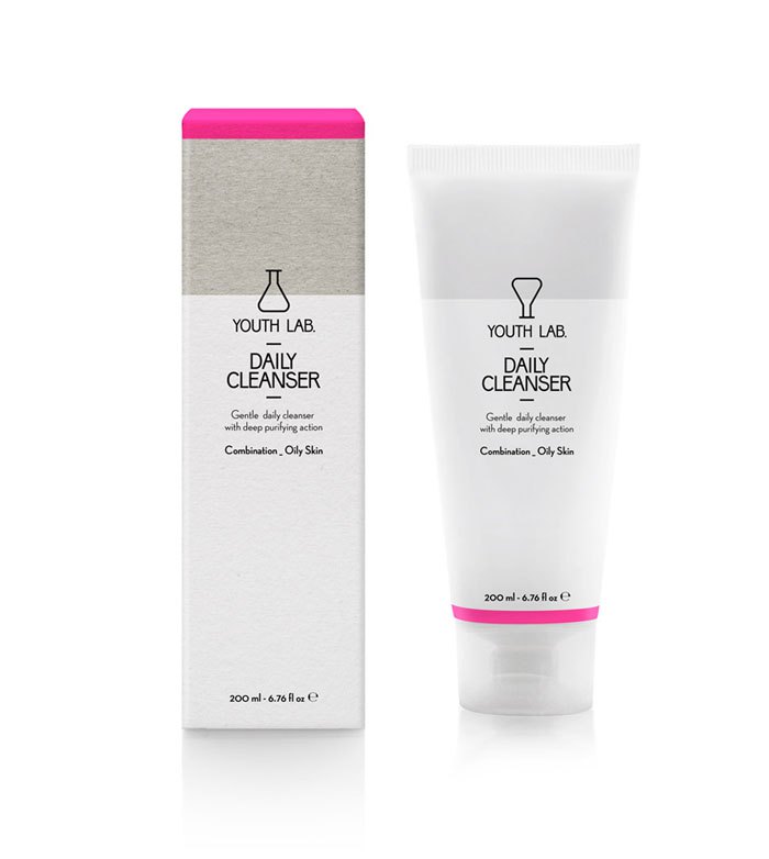
daily cleanser combination_oily skin 日用洁面乳(混合到油性肌肤)
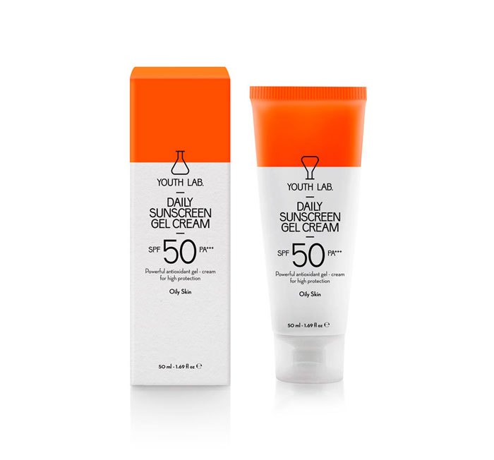
daily sunscreen gel cream spa 50 pa+++ oily skin
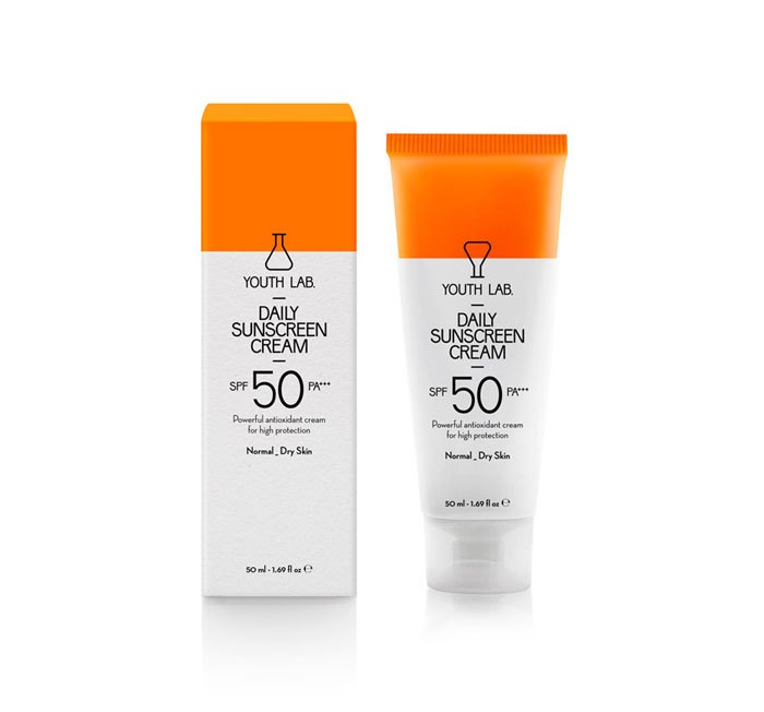
daily sunscreen gel cream spa 50 pa+++ normal_dry skin
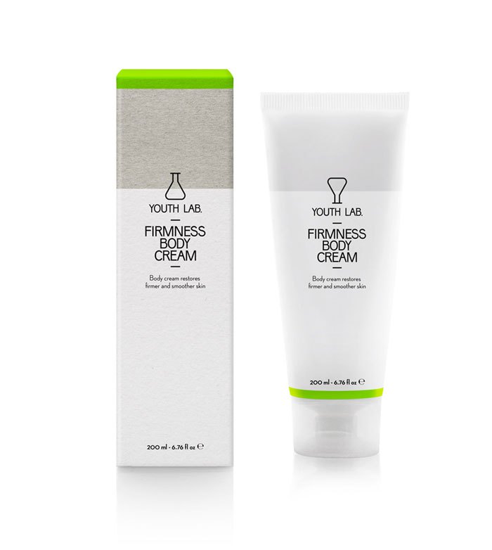
firmness body cream 紧致身体乳
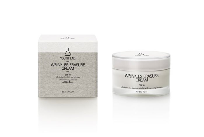
wrinkles erasure cream spf 10 all skin type 祛皱霜 spf 10
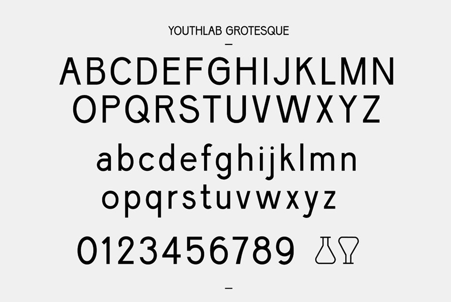
专为品牌设计的字母、数字及icon
HUFU.CLUB后记:
此设计风格简洁,舒服,特有字母数字及icon,为产品添色不少。特别是这个小量筒,在花盒上正面放置,显得稳重及专业,而在软管上,倒置,其轮廓与软管形状非常的一致,更亮点是:像计时的流沙瓶,莫名的有种时间紧迫感,提醒用户赶紧使用完毕吧,你是否也有这种感觉呢?欢迎留言。
? 2017 - 护肤俱乐部 - www.hufu.club 转载需注明出处
推荐资讯
- 气雾灌装及铝罐工厂资源一览-长期更新
- 2023-03-06
- 纯铝管及母子软管国内上下游供应情况 - 定期更新
- 2023-02-11
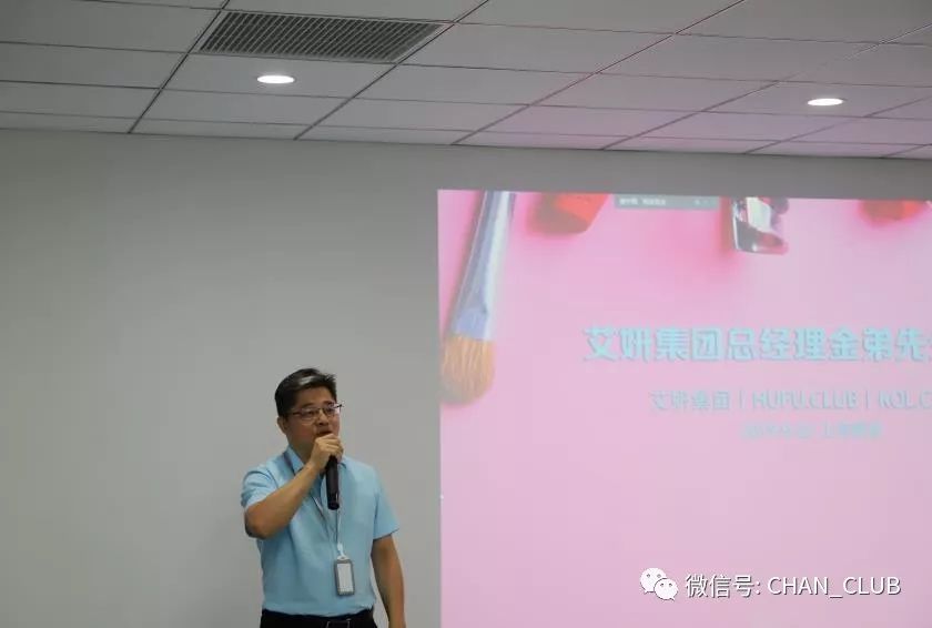
- 艾妍 | HUFU.CLUB|KOL.CLUB 产品开发及后产品流量运营活动
- 2019-09-24
- 《彩妆全解码——FACE ID》与阿芙旗下彩妆品牌达成赞助合作
- 2019-09-19
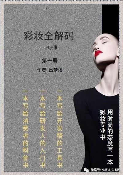
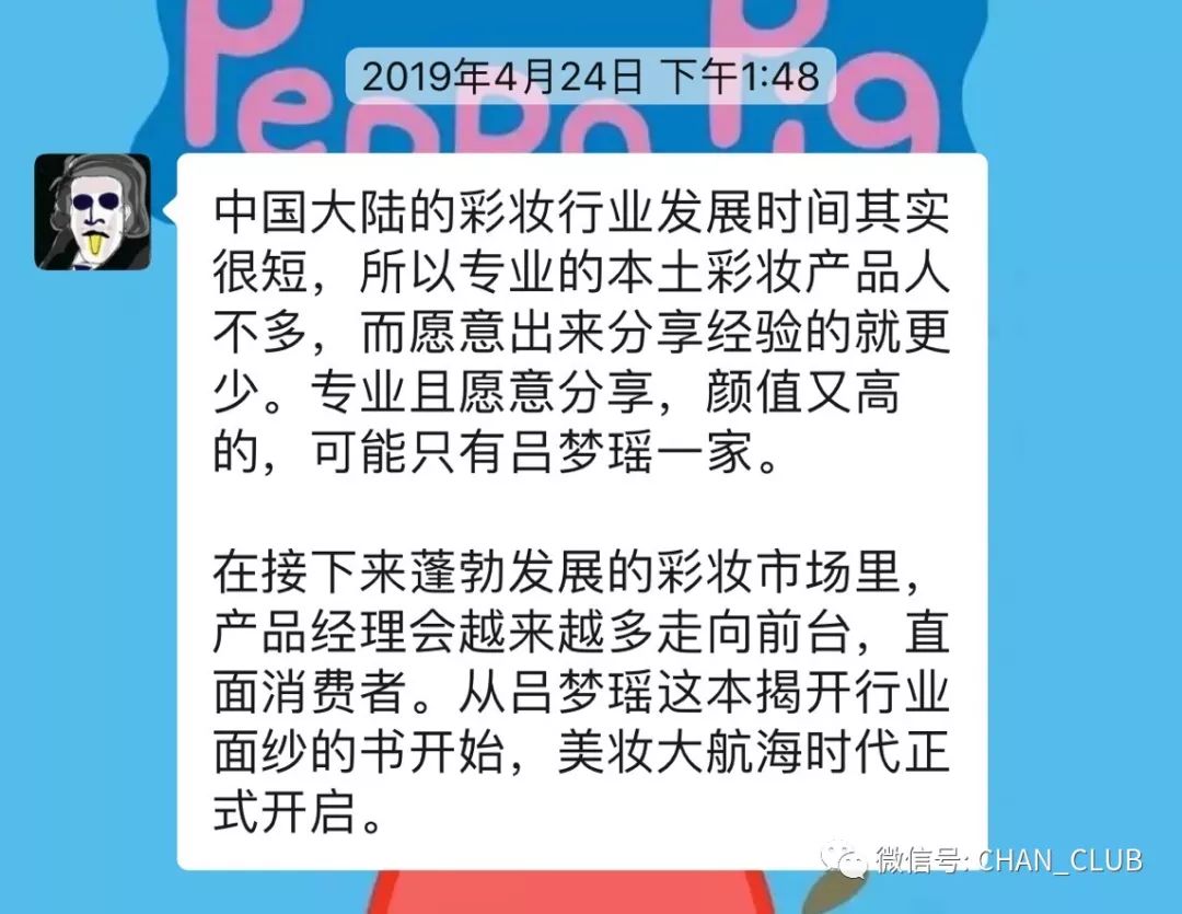
- 《彩妆解码—FACE ID》书籍启动...
- 2019-03-28
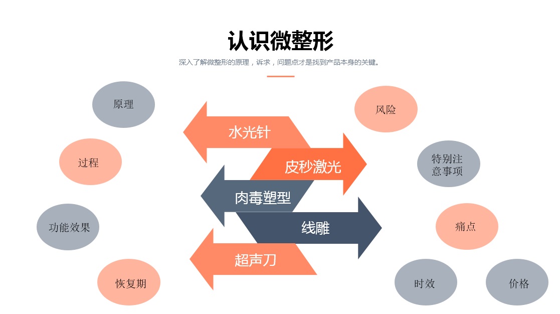
- 轻医美系列课堂:轻医美不轻(下) by 吕梦瑶
- 2018-11-02
- 轻医美系列课堂:轻医美不轻(上) by 吕梦瑶
- 2018-11-02
 广告2
广告2TOP排行
广告3

:
哈哈~品牌名字为youth lab 年轻实验室